Nasra's blog
Wednesday, 20 March 2013
Monday, 4 February 2013
Thursday, 31 January 2013
PRODUCING DIGIPACK
Back Cover
We added a barcode, the website and the songs name, all the text are the same font so it relates to the front cover and the advert, the text is white so it can stand out from the image.
We added more song names as most singles offer more then one song like a remix. We changed the colour of the text as some of the text couldnt be seen as some parts of the image is bright, therefore we changed the colour of the text to black. However we didnt change the colour of the website so the audience can know thats the artist website.
Final
We changed the size of the text so the background image can be seen too. We also aligned the text to the centre of the backcover as thats the main focus.
Wednesday, 30 January 2013
PRODUCING DIGIPACK
Advert
We added the same house style as the digi pack, the text is the same and the colour scheme. For the artist name we used the same layout at the digipack so the audience will know that they connect. The the songs name is positioned on the same place as the album too. The text is black so it can stand out from the image as the image is light. We added the release date of the song beneath the songs name which is smalled then the name. The website is at the bottom in white text so its different to the other texts.
We made a few changes to the final product. We added a black banner at the bottom on the advert so the white text of the website's name can be seen clearer for the audience.
Final
We dragged the tha banner so it looks more professional as most websites are places at the bottom of the advert.
Monday, 28 January 2013
PRODUCING DIGIPACK
This is the inside left of our digipack, we made the image dark to relate the negative emotions of our video. We added text so when the audience takes the CD out of the package they see Florence's name and the songs name. We made the next white so it can stand out from the background.
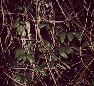
We made slight changes to the inside right, such as making the image even darker and adding red tones to it as this represents the negative side of her emotions more. We added dark edges to make the leaves the key point, as this is part of our music video location. We took the text out as we want the CD to blend with the inside right.
Thursday, 17 January 2013
FEEDBACK ON PLANNING CD AND ADVERT
Today we've showed the class our CD and advert in order to gain feedback on what could be improved
Subscribe to:
Posts (Atom)


